Gravura Designs
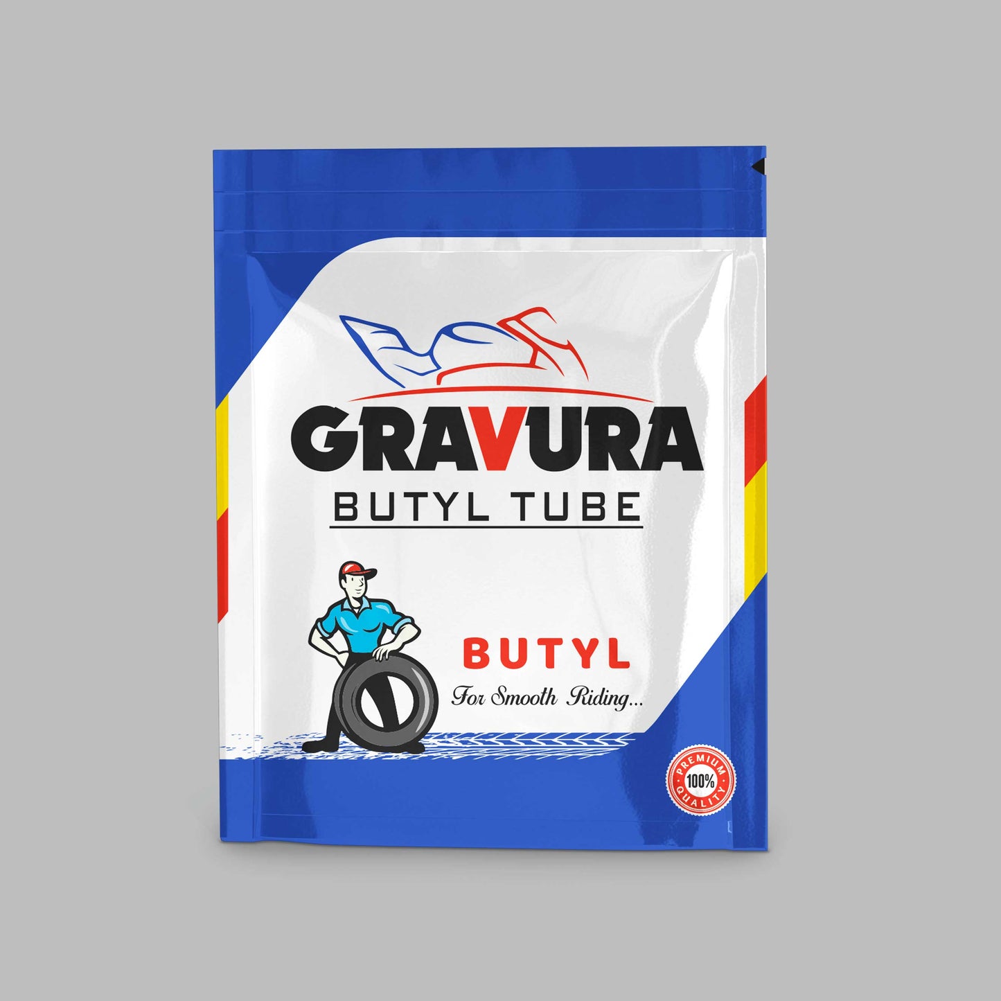
GR-28 - Classic Rider-Themed Butyl Tube Packaging Design – Clean, Trustworthy & Retro-Inspired
GR-28 - Classic Rider-Themed Butyl Tube Packaging Design – Clean, Trustworthy & Retro-Inspired
Couldn't load pickup availability
Product Description:
Capture a sense of heritage and reliability with this rider-themed butyl tube packaging design. Featuring a strong character illustration, clear typography, and clean color zones, this design evokes the trustworthy image of roadside service and long-lasting performance. With a crisp blue-white backdrop and bold red accents, it’s visually aligned for brands that want to connect with customers through confidence, tradition, and clarity.
Crafted to feel approachable yet professional, the layout uses bold vertical labeling, tire tread graphics, and a stylized mechanic figure—perfectly suited for the automotive or utility sector.
Design Highlights:
- 🧍♂️ Mechanic Mascot Illustration: Adds a friendly, service-oriented appeal that builds consumer trust.
- 🔵 Blue, White & Red Color Scheme: A clean tri-color layout symbolizing professionalism, safety, and clarity.
- 🛞 Tire Tread Background Accent: Suggests traction, strength, and durability without overpowering the visuals.
- 🖋 Stylized Tagline Placement: "For Smooth Riding..." in elegant script adds a soft human touch to a rugged product space.
- ⬛ Bold Vertical Font Usage: Easy-to-read orientation enhances visibility on store shelves or stacked displays.
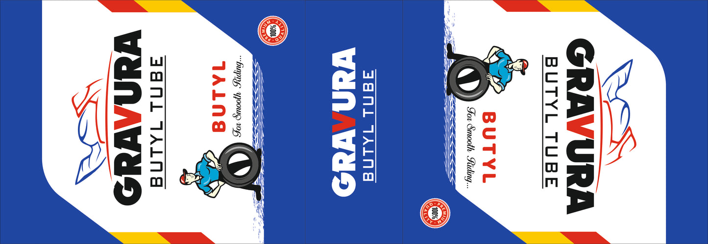
Packaging Details:
- Three-Side Panel Layout: Designed for foldable box or pouch formats with central branding focus.
- CMYK Print-Ready Colors: Optimized for high-quality offset or digital printing techniques.
- Editable Content Zones: Easy to localize or rebrand while maintaining the overall structure.
- Rounded Corner Accents: Adds a subtle modern edge to a traditionally styled package.
Use Case Suggestions:
- Ideal for inner tube packaging in the bicycle, scooter, or motorcycle categories.
- Can be adapted for automotive accessories or tire-related products.
- Works well in retail or mechanic service center product lines.
- Suitable for brands targeting utility-conscious or working-class markets.
Why It Works for You:
- ✅ Approachable Branding Appeal: Builds consumer confidence with a classic, service-based design.
- ✅ Memorable Illustration: The mascot-style character adds strong brand recall and friendliness.
- ✅ Easy Market Adaptation: Timeless layout that fits both premium and mid-range product lines.
- ✅ Retail-Ready Aesthetic: Clear, bright visuals stand out in both physical and online retail spaces.
Share