Gravura Designs
GR-33 - Clean & Vibrant Packaging Design for Automotive Butyl Tube – Purple & Orange Theme
GR-33 - Clean & Vibrant Packaging Design for Automotive Butyl Tube – Purple & Orange Theme
Couldn't load pickup availability
Product Description
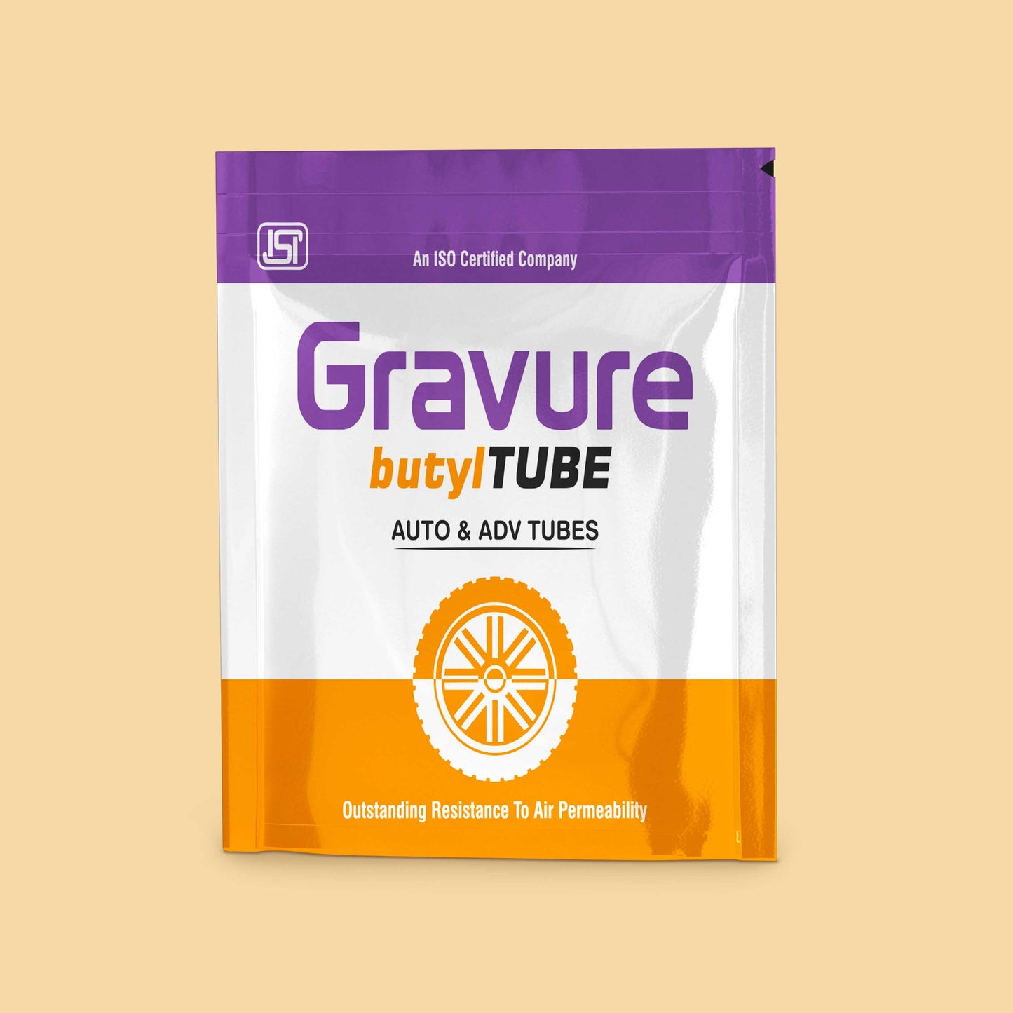
This modern packaging design template blends minimalism with energy, tailored specifically for automotive butyl tube products. It uses high-contrast colors—bold orange, clean white, and vibrant purple—to project confidence, technical reliability, and brand clarity. Developed for shelf impact and distribution appeal, this layout ensures maximum visibility, functionality, and brand consistency.
Design Highlights
- Dual-Tone Scheme: Purple and orange pairing delivers contrast and brand differentiation
- Center Wheel Icon: Bold central graphic enhances automotive identity while creating balance
- Vertical Branding Panels: Maintains strong identity across all visible box sides
- ISO Certification Mark Placement: Builds credibility and trust in compliance-driven markets
- High Readability: Large, spaced typography enhances legibility in both retail and warehouse settings
Packaging Details
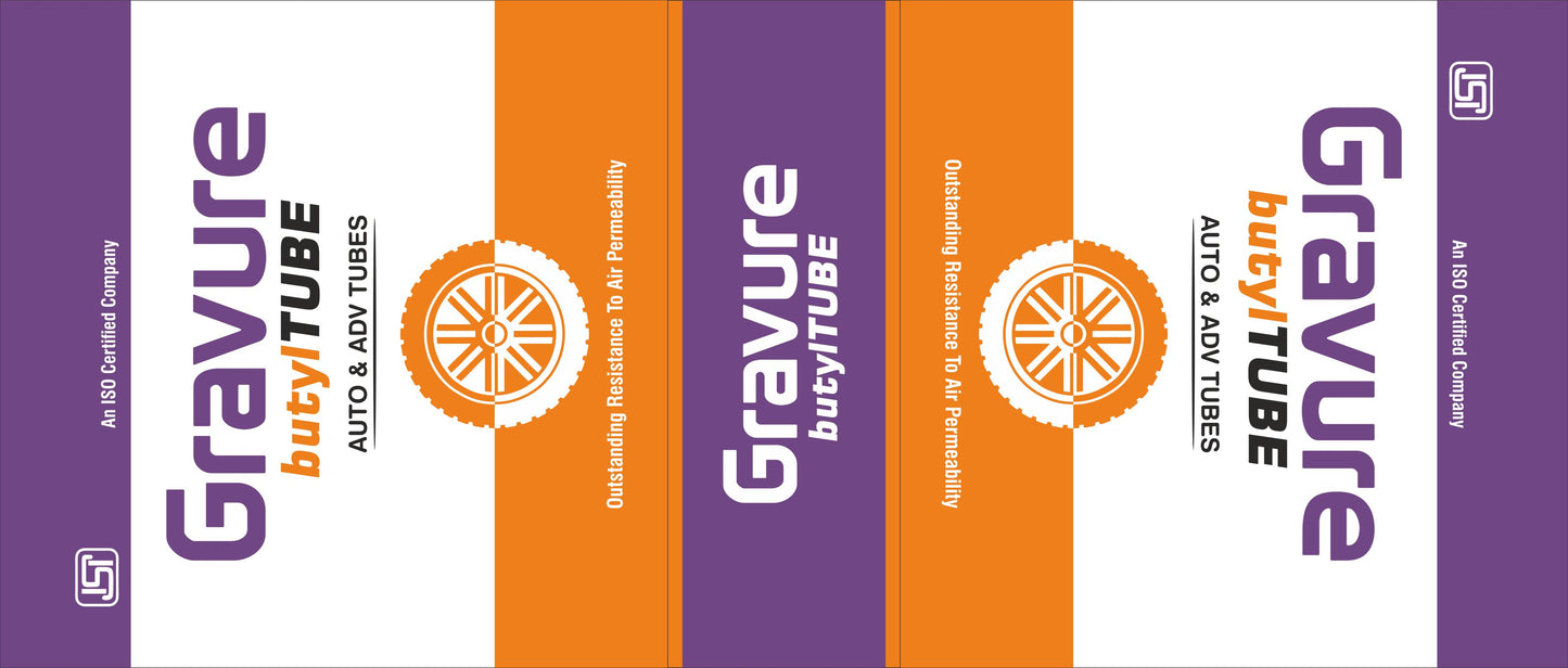
- Structure: 3-panel layout suitable for tube or tire box packaging
- Finish Options: Flexible for both matte and glossy surface treatments
- Side Panels: Mirror the core branding with consistent orientation for upright shelf placement
- Icon Usage: Industry-standard visual elements included for recognition (compliance, certification)
- Custom Color Blocking: Effective use of white space to create contrast without visual overload
Use Case Suggestions
- Retail Automotive Outlets: Designed for eye-level visibility and rapid SKU identification
- Workshop Distribution: Clear iconography and label hierarchy make it ideal for bulk use in service centers
- Multi-SKU Line Extensions: Easily replicable for various tire/tube types using the same design foundation
Why It Works for You
This packaging design is built for scalability, readability, and impact. Whether placed on a store shelf or in a warehouse, the color balance, bold graphics, and crisp typography ensure the product always stands out. The strategic blend of clean white with industrial orange and premium purple supports both mass-market appeal and professional trust—ideal for businesses targeting quality-conscious consumers and distributors alike.
Share